Case Study
All-in-one dashboard for compliance insights and analytics

Compliance rate - 24% increase in compliance rates within the first quarter.
Business impact - 15% increase in product demo conversion rates.

Jones is an AI-driven platform that automates compliance management for vendors and tenants in the built world.
What’s the problem?
What’s the opportunity?
Property managers handle thousands of Certificates of Insurance (COIs) daily with varying compliance statuses. Many oversee dozens or even hundreds of buildings, making it nearly impossible to track such large amounts of compliance data manually. Without an efficient analytics tool, teams struggled to stay on top of compliance requirements.
Our goals for this project were to:
- Improve operational efficiency
- Increase compliance rate
- Appeal to potential new customers
My research process
.png)
User interviews
Through a series of user interviews and sessions with CSMs, I gathered insights from property managers managing compliance for portfolios spanning multiple properties.
“In one of my properties, I manage over 3,000 vendors, and to track compliance, I have to check each one manually. It’s incredibly time-consuming, and I often feel like I’m wasting time reviewing vendors who are already compliant. It would be helpful to have an indicator or a tool that highlights only the vendors that require my attention right now.”
- K., Property Manager
“My biggest challenge is keeping compliance rates high across all our properties. If vendors aren’t meeting requirements, we’re taking on unnecessary risk—and right now, I don’t even have an easy way to track that.”
-J., Property Manager
Market research
During my competitive analysis, I evaluated platforms like NetVendor, SmartCompliance, and Enterprise Risk Control. None provided the intuitive, data-driven visualizations our users needed. Seeking inspiration, I analyzed modern data-heavy platforms like Zendesk and Mixpanel to identify best practices.

SmartCompliance

Enterprise Risk Control

Checkr

NetVendor
Key takeaways:
- Surface overall and per-property compliance status to provide users with clear visibility into performance at both macro and granular levels.
- Enable advanced filtering by property name and status to streamline navigation and support efficient data retrieval across portfolios.
- Incorporate COI expiration tracking to manage renewals and reduce the risk of non-compliance proactively.
Design challenges
During usability testing, I encountered two major challenges that required adjustments:
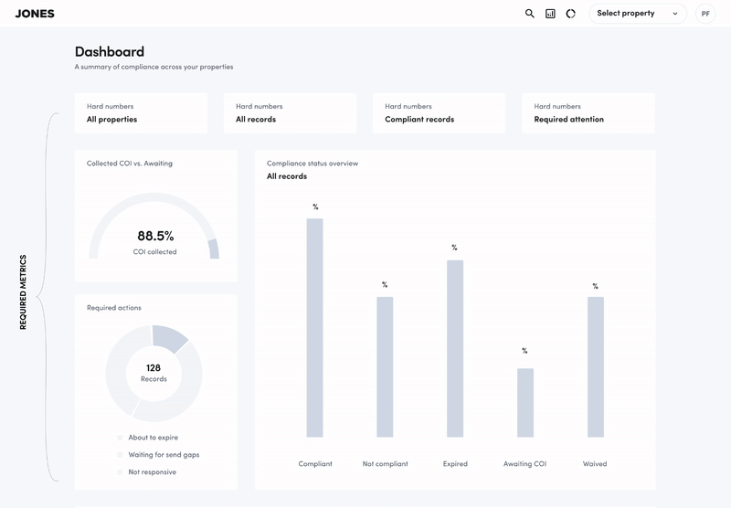
Page Length & Scrolling Behavior
The initial wireframe was too long, leading users to overlook key metrics below the fold. We improved usability by removing non-essential widgets to keep core insights within the visible area.
Confusing Metrics
The “Collected COI vs Awaiting” widget confused users, with many unsure of its purpose. Due to its low clarity and value, we removed it to simplify the dashboard. This iteration helped prioritize key insights, resulting in a clearer, more effective layout.
Drill-down filtering
A key improvement was adding a drill-down experience—clicking on metrics now filters vendors dynamically. This gave property managers quick access to detailed, vendor-specific compliance issues, helping them focus on what needs attention most.
.png)
Drill-down page
Components and states
Additionally, I created design system components for all widgets, including those planned for future development phases. This ensured consistency across the dashboard while allowing for scalability and seamless integration of upcoming features.
.png)
Components
Impact & Results
Compliance Rate
The introduction of a clear overall and property-specific compliance status led to a 24% increase in compliance rates across pilot users within the first quarter.
Business Impact
Feedback from sales teams indicated that the new analytics capabilities increased product demo conversion rates by 15%, positioning Jones as a standout solution compared to competitors like NetVendor and SmartCompliance.
Final thoughts
Many thanks for taking the time to read this. Hit me up anytime on p.filichev@gmail.com to let me know what you think, ask questions, talk product, or say hi.
Case Study
All-in-one dashboard for compliance insights and analytics
Compliance rate - 12% increase in compliance rates within the first quarter.
Adoption - maintained a 65% monthly active seller rate.
Retention - 53% of users renewed their subscription.
Jones is an AI-driven platform that automates compliance management for vendors and tenants in the built world.
What’s the opportunity?
Property managers handle thousands of Certificates of Insurance (COIs) daily with varying compliance statuses. Many oversee dozens or even hundreds of buildings, making it nearly impossible to track such large amounts of compliance data manually. Without an efficient analytics tool, teams struggled to stay on top of compliance requirements.
Gigs categories
While this support was valuable, we realized it wasn’t being monetized. Given the competitiveness of the platform and resource constraints, we saw an opportunity to create a premium, subscription-based program—Seller Plus—offering exclusive benefits to our sellers, including personalized support and advanced business tools.
Video
Desk research
Even though I have done dashboard design in the past, I always find something new in resources like Medium or UX Planet. There are always fresh, more convenient, and functional solutions that need to be taken into account.
Among the many articles on this topic, I would like to highlight the following that gave me a great deal of information:


Market research
What’s a Rich Text element?
During my competitive analysis, I discovered many compliance management tools such as NetVendor, SmartCompliance, Enterprise Risk Control, etc. However, none of them offered the comprehensive solution our users were asking for — automatic and easy to understand data visualization.
Given the lack of innovation in the property technology market, I got inspiration from more modern services like Zendesk and Mixpanel — in search of the perfect dashboard.
SmartCompliance
Enterprise Risk Control
Checkr
NetVendor
User research
New Sellers
New sellers, those who had been on Fiverr for less than a year, expressed that their primary challenge was attracting new clients (67%). When asked about tools that could support their success, the most frequently selected option was personalized coaching (58%), followed by marketing tools (45%).
“My biggest challenge is keeping compliance rates high across all our properties. If vendors aren’t meeting requirements, we’re taking on unnecessary risk—and right now, I don’t even have an easy way to track that.”
Level 1 & Level 2 Sellers
For Level 1 and Level 2 sellers, the top challenges shifted towards understanding business performance (52%) and setting the right price for gigs (47%). Many sellers mentioned difficulties in determining competitive yet profitable pricing.
“I wish Fiverr had better tools to show me what pricing strategies work best for my category.”
Top-Rated Sellers
The most experienced group, Top Rated Sellers, expressed less concern about attracting new clients. Instead, they focused on advanced analytics (65%) and marketing tools (58%) to scale their businesses further.
“I already have a steady client base, but I need deeper insights into customer trends and marketing performance.”
User flow development
After defining the basic structure and pages, I developed a more detailed user flow. I added entry points leading to the landing page and considered various scenarios for sellers with gigs in different categories.

User flow
Entry points

Earnings page

Seller Flow
Once the structure was validated, I focused on refining the final UI to ensure it was both visually appealing and highly functional. My primary goal was to create an interface that not only presented compliance data effectively but also allowed for deeper investigation when needed.
- I designed multiple widget states, including empty states to provide better UX and guide users on how to take action.
- Success states were implemented for key metrics, ensuring positive reinforcement when compliance was maintained.
- I developed a drill-down experience, allowing users to click on specific metrics to apply vendor filters dynamically, making it easier to pinpoint vendors requiring immediate attention.
.png)
Seller Plus landing page
After successful payment, the users get access to the program page where they can do the following:
- Business development → Choose CSM, schedule online meetings
- Marketing tools → Send and manage coupons for buyers
- Analytics → Gig conversions, order stats, keyword visibility
- Exclusive content → Private webinars and content
- Program Management → Manage subscription
.png)
Seller Plus program page
Performance metrics
Adoption & Engagement
Maintained a 65% monthly active seller rate, indicating consistent program engagement.
Retention & Satisfaction
53% renewal rate, showcasing the program’s value and stickiness among sellers.Positive feedback highlighted the impact of data-driven insights on improving service quality and competitiveness.
What sellers say
Seller Plus sellers have shared their experiences, highlighting the most valuable features and benefits of the program. From personalized business coaching to advanced analytics, sellers have found significant value in leveraging these tools to scale their businesses.


Many thanks for taking the time to read this. Hit me up anytime on p.filichev@gmail.com to let me know what you think, ask questions, talk product, or say hi.
Case Study
All-in-one dashboard for compliance insights and analytics
Compliance rate - 12% increase in compliance rates within the first quarter.
Key entry point - 34% of enrollments originated from the Analytics page.
Engagement - 220% boost in Analytics usage after enrollment.
Jones is an AI-driven platform that automates compliance management for vendors and tenants in the built world.
What’s the opportunity?
Property managers handle thousands of Certificates of Insurance (COIs) daily with varying compliance statuses. Many oversee dozens or even hundreds of buildings, making it nearly impossible to track such large amounts of compliance data manually. Without an efficient analytics tool, teams struggled to stay on top of compliance requirements.
User research
To ensure we were designing for real user needs, I conducted qualitative research with Fiverr’s Customer Success Managers (CSMs), who interact with sellers daily.
Insights
- Sellers lacked context on what numbers meant and how to act on them.
- They needed comparisons (e.g., "How do I stack up against top sellers?").
- Keyword optimization was underutilized—sellers didn't know how buyers found them.
- CSMs spent too much time explaining basic metrics that sellers could learn on their own.
Dashboard architecture
💰 Business analytics
Seller statistics compared to the selected group (%). Create FOMO, show how much more I can make. Drive people to action.
📊 Traffic analytics
Show different funnels and programs sellers get their orders from. Educate them how to improve their order funnel.
🔍 Keywords (Search)
Show trend in the subcategory so sellers can get more exposure. For Fiverr, the reason is to fill the right shelves in the marketplace.

To create a structured approach, I first mapped out the dashboard’s information architecture, ensuring that all key metrics were clearly structured. The goal was to create an intuitive layout that allowed property managers to quickly grasp compliance insights.

Performance comparison
Advanced Analytics
Once the structure was validated, I focused on refining the final UI to ensure it was both visually appealing and highly functional. My primary goal was to create an interface that not only presented compliance data effectively but also allowed for deeper investigation when needed.
- I designed multiple widget states, including empty states to provide better UX and guide users on how to take action.
- Success states were implemented for key metrics, ensuring positive reinforcement when compliance was maintained.
- I developed a drill-down experience, allowing users to click on specific metrics to apply vendor filters dynamically, making it easier to pinpoint vendors requiring immediate attention.
Locked features
All previously locked tabs become available after the user signs up for the program. Each tab contains filters for gigs, as well as a time interval (30-60-90 days). On the Gig performance page, the user gets information about the conversion rate, click-through rate, and a comparison with other sellers in the same business category.
.png)
Gig performance
Since Fiver has different channels and labels buyers use to find gigs, I've added relevant widgets to the Orders Breakdown page. If the seller does not have orders from some programs, this should motivate him to participate — for example, Promoted Gigs or Fiverr Business.
Orders breakdown
The third tab, available to Seller Plus members, shows the top key search terms for which users find the seller's gig. For each keyword, the seller can see the number of impressions, clicks, orders, conversion rate, and revenue.
.png)
Top keywords
Finally, I updated the UI for the existing homepage in addition to the new analytics categories. I changed and simplified the logic of the Overview widget, added a few filters, and updated the colors so that all the analytics pages look and feel in the same style as the new branding.
Updated overview
Performance metrics
Key entry point
34% of Seller Plus enrollments originated from the Analytics page, positioning it as a primary driver of conversions.
Increased engagement post-enrollment
Analytics usage boosted by 220% after sellers joined the program, reflecting its growing relevance in their day-to-day decisions.
What sellers say
Seller Plus sellers have shared their experiences, highlighting the most valuable features and benefits of the program. From personalized business coaching to advanced analytics, sellers have found significant value in leveraging these tools to scale their businesses.
Many thanks for taking the time to read this. Hit me up anytime on p.filichev@gmail.com to let me know what you think, ask questions, talk product, or say hi.
Case Study
All-in-one dashboard for compliance insights and analytics
Compliance rate - 12% increase in compliance rates within the first quarter.
Jones is an AI-driven platform that automates compliance management for vendors and tenants in the built world.
What’s the problem?
Property managers handle thousands of Certificates of Insurance (COIs) daily with varying compliance statuses. Many oversee dozens or even hundreds of buildings, making it nearly impossible to track such large amounts of compliance data manually. Without an efficient analytics tool, teams struggled to stay on top of compliance requirements.
My goals for this project were to:
Design an application that will allow managers and owners to see the key performance indicators of the restaurant and use this information to grow their business.
Responsibilities:
- Conducting interviews
- Paper and digital wireframing
- Low and high-fidelity prototyping
- Conducting usability studies
- Accounting for accessibility
- Iterating on designs
My research process
I conducted interviews and created empathy maps to understand the users I’m designing for and their business needs. A primary user group identified through research was restaurant owners and shift managers who wants to have clear visibility on the restaurant performance.
To create a structured approach, I first mapped out the dashboard’s information architecture, ensuring that all key metrics were clearly structured. The goal was to create an intuitive layout that allowed property managers to quickly grasp compliance insights.
Personas

Restaurant owner
about
goals
- Keep restaurant full and busy
- Get repeat customers
- Opening new restaurant

Shift manager
about
goals
- Keeping restaurant full and busy
- Personnel performance evaluation
User pain points

Time
Restaurant owners are too busy to think about new ways to increase the revenue.

Visibility
Lack of performance information as there is no single source of data.

IA
A large number of performance indicators and thousands of reports that are difficult to process.
User journey map: Restaurant owner
Goal: A fast and easy way to get an employee performance report on email.

Mapping
I organized and structured data collected from the restaurant's various systems and sources in a way that is easy to understand, access, and use.

Information Architecture
Live dashboard
The dashboard is the home page that summarizes all the main metrics from the categories of sales, products, employees and customers. All performance indicators can filtered by branch.

Live Dashboard

Live Dashboard
Sales & Items
Provides insights into the sales of different menu items or categories. Sales can be filtered by items, shifts, hours, and employees.

Sales & Items

Sales & Items
Employees
The employee profile page includes various metrics such as average order time, customer satisfaction ratings, table turnover rate, and average check size.

Employees
Customers
The customer page reflects all relevant metrics such as frequency of visits, average check size, customer feedback ratings, and customer lifetime value.

Customers
Takeaways
Impact & Results
🧭 Key Usability Insights
90% of participants successfully identified key performance metrics (sales, revenue, customer satisfaction) in under 30 seconds, confirming the clarity and accessibility of the dashboard.
💡 Opportunities for Growth
Participants expressed strong interest in customizable reporting features to align insights with individual business goals.
💬 Positive User Feedback
Users highlighted the app’s intuitive navigation and clean design, which made critical insights more actionable and approachable.
What’s next?
- Conduct another round of usability studies to validate whether the pain points users experienced have been effectively addressed.
- Conduct more user research to determine any new areas of need
Many thanks for taking the time to read this. Hit me up anytime on p.filichev@gmail.com to let me know what you think, ask questions, talk product, or say hi.
Case Study
All-in-one dashboard for compliance insights and analytics
Compliance rate - 12% increase in compliance rates within the first quarter.
Jones is an AI-driven platform that automates compliance management for vendors and tenants in the built world.
Why redesign?
Property managers handle thousands of Certificates of Insurance (COIs) daily with varying compliance statuses. Many oversee dozens or even hundreds of buildings, making it nearly impossible to track such large amounts of compliance data manually. Without an efficient analytics tool, teams struggled to stay on top of compliance requirements.
Goals for this project:

Messaging
Refine messaging to be more in aligned with our values and benefits.

New Pages
Create new pages that are relevant for ICP prospects that might be browsing.

Look & Feel
Refresh the look and feel in accordance with the new brand guidelines.
My design process
Based on the audience research conducted for the website, we have identified several key areas of improvement for our content strategy. Using this information, we have created a content strategy that focuses on producing high-quality, engaging content that meets the needs and interests of our target audience.

Site map
After finalizing the content strategy and new information architecture, our next step was to create wireframes that mapped out the structure of each page for the MVP version of the project.

Wireframes
Design system
Once the wireframes have been created and edited, the next step was to start building the final user interface. The first thing I started with was a design system - a collection of reusable components that can be used throughout the website, ensuring consistency and efficiency in the design process.
I started with primitive elements such as colors, typography styles, buttons, and form fields. These elements were combined to create more complex components such as navigation menus, headers, and footers.

Foundation
Basic colors and typography styles, including headings, body text, lists, and more.


Images
Stylized images and other visual assets for website use.


Forms
Text and drop-down fields for getting the user input.


Cards
Surfaces that display content and actions on a single topic.


Navigation
Тop header navigation (mega menu).

Pages overview
After creating both the primitive elements and more complex structures, I began to assemble the components into pages.

Property managers


Construction


The Jones Network

Performance metrics
The new website is showcasing an improvement in the main KPIs like organic relevant traffic, visitor engagement, and the conversion rate.
Time on page
Тhe average visitor's time on the page increased by 15%
Bounce rate
The number of visitors who left the website after viewing only one page decreased by 10%
Conversion rate
The number of live demo requests on a website increased by 4%
Secondary conversions
The number of secondary conversionssuch as email submissions or downloads increased by 18%
Life after launch
Optimize for conversions
- Add more lead magnet spots on solution pages and home pages
- Send the “half leads” into CRM by connecting CTA to HubSpot
Consolidate high value content on the website
- Case studies hub and pages: B&A, SavCon, Gaedeke
- Blog optimization
- Webinar and Newsletter Hub pages
Accommodate demand gen and content
- Design a LP template for downloads
- Design a campaign template LP
- Design an SEO page LP
Many thanks for taking the time to read this. Hit me up anytime on p.filichev@gmail.com to let me know what you think, ask questions, talk product, or say hi.
Case Study
All-in-one dashboard for compliance insights and analytics
Compliance rate - 12% increase in compliance rates within the first quarter.
Jones is an AI-driven platform that automates compliance management for vendors and tenants in the built world.
What’s the opportunity?
Property managers handle thousands of Certificates of Insurance (COIs) daily with varying compliance statuses. Many oversee dozens or even hundreds of buildings, making it nearly impossible to track such large amounts of compliance data manually. Without an efficient analytics tool, teams struggled to stay on top of compliance requirements.
Goals for this project:
- Enhance efficiency
- Reduce operational costs
- Scale the platform to serve more customers while keeping headcount flat
My research process
The main objectives of the research were to identify high-value opportunities for AI in compliance management while understanding user concerns and potential barriers to adoption.
User interviews
Conducted in-depth interviews with compliance managers, auditors, and vendors to understand their pain points, workflows, and expectations from an AI-driven solution.
Pain points
- Chasing vendors for updated certificates was a major time sink.
- Verifying insurance requirements across multiple projects was error-prone and tedious.
Trust in AI systems
- Users emphasized the need for high accuracy rates (95%+).
- Clear explanations of AI decision-making processes were critical for building trust.
Human judgment over AI
- Complex requirements were seen as areas where human judgment was irreplaceable.
- High-risk or high-value contracts were also required human oversight.
Design challenges in AI for compliance
- Ensuring trust — AI outputs need to be explainable and verifiable.
- Maintaining control — Users need the option to override or edit AI actions.
- Balancing automation vs. human review — Compliance mistakes have real financial and legal consequences.
AI agent suite
The research findings directly informed the design of an AI agent that takes multiple skills across three key areas: Collection, Compliance, and Auditing. Designed to integrate seamlessly into users’ workflows.
Outlook Add-On
Email-based interaction with the CoPilot for Collection workflows, delivering value directly in users’ inboxes.
SaaS compliance agent
Full suite of tools with skill buttons and a conversational chat interface.
Outlook Jones CoPilot
Streamline collection and compliance workflows directly from the mailbox with an Outlook add-in that identifies records in emails, displays their compliance reports from Jones, and enables actions—all without needing to access the platform.
JTBD: Collect insurance documents and respond to requests and queries from vendors and tenants directly from where they work—their inbox—without needing to switch platforms.
Feature details
- Install the Jones CoPilot add-in in MS Outlook and use it through the task panel.
- The add-in will automatically detect vendor and tenant records in every email sent to the user following a Jones email notification.
- View the full vendor/tenant report.
- Take immediate actions, such as uploading a COI, sending gaps, archiving and muting records, without needing to enter the platform.
Use cases
Explain the gap
Problem: Property managers are swamped with a high volume of notifications from both the Jones platform and vendors, making it time-consuming to craft responses.
Solution: To streamline this process, I introduced the smart compose button, which leverages AI to analyze the entire notification thread and generate contextually relevant suggested responses. For the MVP, we focused on the "Explain the Gap" feature. When activated, the AI analyzes the thread and provides a pre-drafted response directly in the reply field.
Impact:
- Reduces response time for property managers.
- Ensures clear and accurate explanations of compliance gaps.
- Enhances user experience by minimizing repetitive tasks.
Upload COI
Problem: Vendors often send COIs via email, requiring property managers to manually upload these documents into the Jones platform for auditing.
Solution: Our prototype introduces a streamlined process within the task panel. The system automatically identifies vendor records and suggests actions for common tasks, such as managing COIs. Property managers can now directly upload emailed certificates into the system, where they are automatically routed for auditing.
Impact:
- Eliminates the need for manual data entry and document handling.
- Reduces errors and improves audit accuracy.
- Saves time for both property managers and vendors.
Bulk follow up
Problem: Managing multiple insurance documents across various vendors and projects is a cumbersome and error-prone process.
Solution: As part of our future roadmap, we plan to introduce an AI-powered chatbot to handle bulk tasks and provide compliance insights. This chat-based functionality will allow users to collect or upload all required insurance documents in bulk within their user account. Based on the input, the system will generate a comprehensive report, providing a clear overview of compliance status and outstanding tasks.
Impact:
- Simplifies document management for large-scale projects.
- Provides a centralized view of compliance status.
- Enhances scalability by handling bulk tasks efficiently.
Auditing agent
The auditing agent is an AI-powered solution that automates the extraction and verification of key data from COIs to ensure compliance, addressing the inefficiencies of manually auditing 80,000 documents monthly. By seamlessly integrating into existing workflows, it reduces errors, saves time, and mitigates compliance risks, enhancing accuracy and operational efficiency.
UX focus
Data Transparency: Extracted data is displayed side-by-side with the original document, allowing users to easily compare and validate information.
User Control: Users can review, edit, and approve AI-generated recommendations, ensuring human oversight and decision-making.
Explainability: Confidence scores and source references are provided to help users understand the AI’s reasoning and build trust in its outputs.
Gradual Rollout: The implementation began with low-risk fields, enabling users to adapt to the system incrementally while minimizing disruption.
Use cases
AI compliance snapshot
Problem: While an auditor takes 10 minutes to audit a single COI, the volume of applications results in property managers waiting up to 48 hours for compliance verification. This often leads to vendors arriving on-site with non-compliant COIs, disrupting operations, increasing costs, and creating avoidable risks.
Solution: To address this, we integrated an AI compliance snapshot feature. This agent analyzes COIs in seconds, generating a compliance snapshot with ~95% accuracy. It highlights compliance gaps and allows property managers to waive minor or insufficient gaps on the fly, ensuring vendors can proceed without delays.
Impact:
- Compliance insights are delivered in seconds, eliminating the 48-hour bottleneck.
- Property managers gain the flexibility to waive minor gaps, enhancing their control over the process.
- Emergency situations caused by non-compliant COIs are minimized, reducing operational and financial risks.
Autocomplete search
In addition to the previous solution, we also implemented a report feature for cases where a property manager invites a vendor who already exists in their account (having previously been invited to work at another building). The AI agent redirects the manager to the vendor's profile, where, in addition to key business indicators such as risk rating and insurance details, the property manager can access an AI-generated compliance report with the ability to compare results across multiple requirements.

Impact:
- Property managers can quickly access vendor profiles and compliance reports, eliminating redundant audits for vendors already in the system.
- Redirecting managers to existing vendor profiles reduces the need for repeated data entry and manual checks, saving significant time.
- Comparing compliance results across multiple requirements ensures consistency and reduces the risk of oversight.
Impact & Results
This large-scale project is still in progress, with AI agents being developed and tested across ecosystems. While final results aren't in yet, early outcomes are promising:
While auditors initially spent more time adapting to the AI agent and reporting errors, after five weeks, the agent’s accuracy improved significantly, and auditors began gaining confidence in its capabilities. This aligns with our goal of building trust and integrating AI into the workflow. These early insights lay a strong foundation for continued success as we refine the agents and address user feedback. The best is yet to come...
Many thanks for taking the time to read this. Hit me up anytime on p.filichev@gmail.com to let me know what you think, ask questions, talk product, or say hi.